A company’s brand should infiltrate every aspect of the operation and reflect how they want to be seen by the world. Branding should set a business apart from others in their industry and concisely convey their tone and mission, even if done wordlessly. Whether you are thinking of branding for a new company or rebranding a current one, there are questions that need to be answered during the planning process.
Questions to ask yourself while formulating your brand:
- Who is your target audience, and do you know how to reach them?
- What makes you different from your competition and how can you express that?
- How can you show the world the problems that your company solves?
- What tone do you want your company to have? Are you able to carry this tone through consistently in every interaction with consumers?
Branding involves a great deal of research and insight into a target audience. It is important to know the age range, socioeconomic status, gender, and location of an audience to accurately gauge what is trending within their niche. It can be helpful to communicate with those from your desired demographic, and possibly even conduct focus groups to collect information that can then be turned into data. When you have statistical information, you can transform this into content!
While creating an image, consistency is key. Choose a tone and stick with it! Don’t let this limit you to strict marketing campaigns, however. Be innovative with your advertisements while keeping your tone consistent. You want consumers to be able to “feel” your brand. Ideally, even if your company name is not attached to an advert, a consumer should be able to pinpoint that ‘oh, this is definitely from ‘Xyz company.’ Give your brand as much personality as a human being, and as we all know from experience there are unlimited qualities out there to choose from to make it 100% unique and memorable.
When deciding on a logo, consider your audience and what company values you want represented. The imagery needs to express these sentiments and the logo should be a condensed, visual representation of your brand’s principles. Consider iconography that appeals to the general public (while still being able to signal to your target audience) and is fresh and up to date. Everyone subconsciously draws conclusions about companies, both positive and negative, from their logo. We infer a brand’s stance on social issues and their feeling towards their audience. For example, displaying a logo featuring a crown or royal figure can come across as anachronistic – many interpret this type of imagery as outdated or elitist.
Once you have your company’s general image solidified, you must carry this through into content marketing. You want your advertisements to be eye-catching and daring, but you should also exercise caution. There is a never-ending stream of companies embroiling themselves in controversy over their brand identity and advertising choices, and much of this backlash can be traced back to branding errors in both general design and content campaigns. When pushing out material in any way, always make sure to think of your intended (and unintended) market and plan for unexpected controversy! While you are brainstorming branding ideas and campaigns it is a good idea to put together employee focus groups where you discuss what could go wrong. Evaluate the ideas from all angles and ask questions such as: How could this be perceived negatively? Is there anything we can do to clarify our ideas so the message is clear? Have we avoided stereotyping and any mention of politics and religion (unless this is your industry)? Yes, it is true that some companies rely on shock marketing to gain attention, but often controversy is detrimental to a brand’s image and survival. One study performed by a New York marketing agency showed that 35% of consumers said that they would not give their business to a company that puts out controversial ads, whether they personally found them offensive or not.
As the years pass and trends change, a company’s iconography, marketing style, and sometimes even their name will undergo multiple transformations. Elite is no exception! Let’s look at the company logo and its evolution.

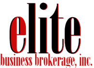
This black and red design was Elite’s original logo, which was created in 2014. It was the first attempt at a logo (before the implementation of our design team) and was quickly scrapped. The logo colors and style do not fit the business brokering industry. Consumers often draw an association between red and spontaneity, aggression, love, and power. These feelings are a bit too emotional for Elite. This industry is facts-based and dedicated to honesty and dependability. The lowercase words, especially when written in a traditional serif font, set a childish tone. (Lowercase logos can be used effectively, especially with chunky slab-serif or decorative fonts. This also depends on the industry).

With a new design team, this was the next logo to be created (in 2015). The color scheme was completely revamped to reflect what Elite stands for in its industry. Blue is associated with trust and security (it is often used by banks) and Elite wanted to emphasize its reliability. Yellow/gold is also associated with intellect.
This logo incorporates a symbol (the ‘e’ on the left) which helps brand the company. If the ‘e’ were shown on its own around the website or on promotional materials, a visual association between the symbol and the company would be drawn. The capitalized, spaced letters give an impression of strength without being overbearing.

This was another complete revamp of the Elite logo done in 2019. The chunky, stamp-like logo from the 2015, which was popular at the time, begun to look slightly dated and was thus removed from this new version. Gradients are still commonly used in logo design, but the combination of gradients in both the symbol and the text is a bit much. In this redesign, a gradient was kept to add depth but the symbol was scrapped to give off a sleeker vibe.

The design from 2019 was softened and the gradient was simplified and made to look more natural. The color scheme was toned down in order to follow the trend of more neutral and streamlined text.

This is Elite’s current logo. The text is more spaced out and modern looking, while still maintaining a professional appearance. In order to effectively brand Elite, a shield logo was implemented. It can be used in conjunction with the logo text or on its own in various advertisements and around the website. The gold takes us back to one of the earlier designs and fits into the color scheme without being too harsh on the eye. This was completed in house by our design team!
Examining Elite’s logo transformation is a testament to just how much thought and consideration should go into your branding decisions, no matter the perceived importance. Consumers notice more than you think! When planning your brand, be precise but make sure not to cage your creativity!
